Photoshop Tutorials: The Little Things to Improve your Designs
Objective & Purpose: Following are short exercises are on techniques that you can use to enhance your bigger designs. My aim is to only include those that can take 10 minutes or less.
For the Spring 2018 class, you will submit them along with your other 2 designs.
#1 Tricks with Custom Shapes:
Using your imagination, you can do lots of enhancements with the Photoshop's custom vector shapes.
- Choose Custom Shape tool.
- From the options menu, Choose Ornaments. Then choose Floral Ornament 3
- Draw the shape.
|

Single |
- Duplicate the Layer (LAYER/Duplicate Layer)
- Flip one layer (EDIT/Transform/Flip Horizontally
- Choose the Move tool. Then nudge (with keyboard arrow) until satisfied with look.
|

Combined for a more
interesting shape |
Here is an example of how you can simply duplicate a frame in order to add visual interest to it. Although I used a banner, you can use this technique on any number of shapes.
 Using almost the same instructions from the above tutorial, draw a banner or shape. Using almost the same instructions from the above tutorial, draw a banner or shape. - Duplicate the Layer (LAYER/Duplicate Layer)
- Choose the Move tool. Then nudge (with keyboard arrow) until satisfied with the shadow you've created
- Then for an even better 3-D look, add a shadow on your lower layer:
- LAYER/Layer Styles.
- Drop Shadow For a more subtle appearance, I used the setting:
Angle 130, Distance 3, Size 3
|
#3 Get Warped
Using similar techniques from #2 above, you will create an interesting frame by skewing the rectangle and overlapping the text.

- Using almost the same instructions from the above tutorial, draw a rectangle by using the Rectangle Tool.
- Skew the the bottom sides of the rectangle by choosing EDIT/Transform/Skew.
- Duplicate the Layer by choosing LAYER/Duplicate Layer. (or pressing Ctrl-J)
- Choose the Move tool. Then nudge (with keyboard arrow) until satisfied with the shadow you've created
- Of course, change your foreground color Then fill back rectangle by pressing ALT-BKS.
- Type text as desired. Overlapping the top line was just my idea of prettifying it.
- Note that the word “attention” is rotated to match the slope of the bottom of the rectangle. (Click EDIT/Transform/Rotate)
|
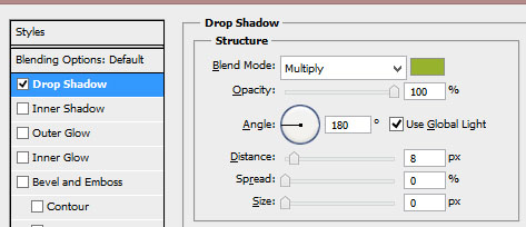
#4 Don't Default on that Shadow!
Fuzzy shadows are not the only way to go. Consider customizing the setting of the shadow. In this simple exercise, by using 180 degree and a hard shadow, the words seem to be lifted off of the page.

- Create a new file or open an existing one.
(The grunge background is NOT a part of this tutorial)
(In case you're wondering, the "&" is typed in a separate textbox.)
- Change the font as desired.
- Choose LAYER/Style/Dropshadow.
- Change the Opacity to 100 for a hard shadow.
- Change the setting to 180 degree angle, Spread of 0, Size of 0.
- Change the Distance to whatever you want.
|