The "DO NOT" Webpages
Do Not Center Narrative Text
Please ... never ever ever center body text. Center alignment is meant for headings, lines in an invitation, and so on. Center alignment of narrative or body text decreases readability and simply looks bad. They tend to have strange line breaks and a tawdry look of unprofessionalism. So, just DON’T DO IT.
As for user-friendliness, suppose that you were reading a 300 page novel, and every page was center aligned. I am certain that you would not like that. Or suppose that an already challenging theory oriented textbook was centered – all 800 pages of it! You would not enjoy reading it. Do not center body text! So, just DON’T DO IT.
Centered text is harder to read because the starting position of each line changes. And remember also that numbered and bulleted lists should always be left-aligned as well to help in quickly scanning the list. Hence, please follow the Golden Rule "do unto others" and
just DON’T DO IT.
Read more about reason.
Do Not Center Bulleted items
- Centered bullets impedes readability.
- The eye has difficulty tracking between lines since they're all starting and ending at different points.
- Centering bulleted text is the work of the devil.
- The point of bullets is to draw the eye to nicely aligned targets that then lead onto, hopefully, short succinct points. If you center the information, the bullets are staggered and lost in the general text.
- Centering bulleted items looks very sloppy.
- Just DON’T DO IT
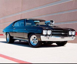
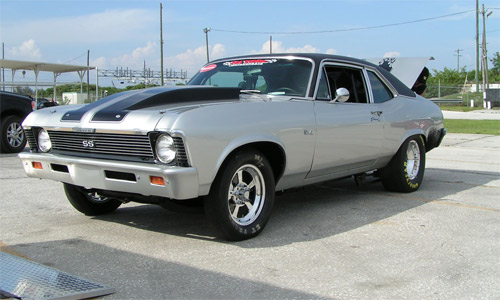
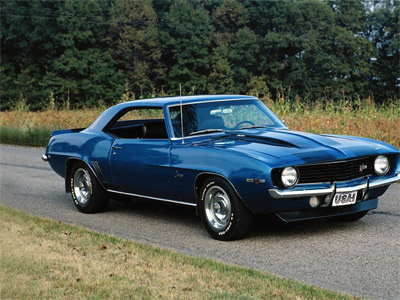
Arrange Images Attractively. This is not a good look!
 Awesome muscle car.
 This is my cousin's car
 Amazing speed.